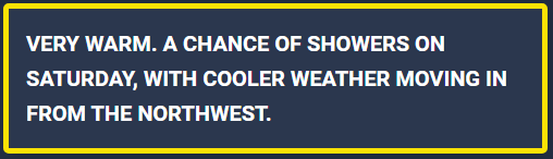
Following up on the translation work from my last post, it’s worth showing where the translated text actually ends up: a small dashboard card that only appears when there’s something worth paying attention to. A colored border — green, yellow, amber, or red — wraps a short warning text, and the whole thing stays hidden entirely when conditions are normal. Simple on the surface, but it’s built on a data source that’s worth understanding properly before you rely on it.
Where the data actually comes from
Home Assistant’s integration for this is literally called “KNMI” — which is a bit misleading. It’s not talking to KNMI (the Dutch national weather service) directly. Under the hood, it pulls from weerlive.nl, specifically the endpoint at https://weerlive.nl/delen.php. weerlive.nl aggregates and republishes KNMI data through its own API, and that’s the actual source HA is querying.
Two practical things worth knowing if you’re setting this up yourself:
- The integration is configured using your latitude and longitude — no manual station selection. weerlive.nl resolves that to the nearest relevant weather data for your coordinates automatically.
- There’s a hard limit of 300 requests per day on the free tier. HA’s default polling interval stays comfortably under that, but it’s worth keeping in mind if you’re combining it with other automations calling the same sensor aggressively, or running multiple HA instances against the same API key.
The dashboard card
The card itself uses custom:config-template-card wrapping a markdown card, with card-mod handling the dynamic styling:
type: custom:config-template-card
entities:
  - input_text.buienradar_knmi_code_en
  - input_text.buienradar_knmi_warning_en
variables:
  title_value: ''
  centered_value: states['input_text.buienradar_knmi_warning_en'].state || 'n/a'
card:
  type: markdown
  title: ${title_value}
  content: ${centered_value}
  card_mod:
    style: |-
      ha-card {
        color: white;
        font-size: 20px;
        font-weight: bold;
        text-transform: uppercase;
        border: {% if is_state('input_text.buienradar_knmi_code_en', 'green') %} green solid 2px !important {% elif is_state('input_text.buienradar_knmi_code_en', 'yellow') %} #FCE205 solid 5px !important {% elif is_state('input_text.buienradar_knmi_code_en', 'amber') %} #FFA500 solid 7px !important {% else %} #FF746C solid 10px !important{% endif %};
      }
visibility:
  - condition: state
    entity: sensor.buienradar_knmi_code_en
    state_not: green
A few things worth calling out:
- config-template-card is what makes the two input_text helpers (the translated code and warning text from the earlier DeepL setup) usable as live template variables inside a standard markdown card.
- The border isn’t just color-coded — it also gets thicker as severity increases: 2px for green, up to 10px for red. It’s a small touch, but it makes the more serious warnings noticeably harder to miss at a glance.
- The visibility block is doing the real work of keeping the dashboard clean: the card is only rendered at all when the code is anything other than green. No warning, no card — one less thing competing for attention on a normal day.
Between the translation pipeline from the last post and this card, the whole thing now runs as a small, readable chain: weerlive.nl’s KNMI data comes into HA, gets translated via the pyscript/DeepL service, and surfaces on the dashboard only when it actually matters.
How does this look like in the HA dashboard when it’s code yellow: